
Working with Color Charts – Datacolor
NOISUF-X“我们中华民国k” – Music Promo
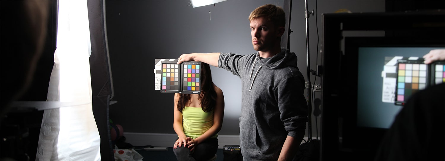
Often what is overlooked in filmmaking are the use of tools specifically designed to make post-production more efficient and successful in what the artists and client are trying to achieve. One such tool are Colour Charts, in this scenario we chose to use Datacolor’s SpyderCheckr 24 due to its high precision spectrally engineered patches. The typical excuse that there is not enough time on-set is erroneous, especially on music videos which rely heavily on aesthetics; are expected to be attainable in post-production. This Blog details a scenario which enabled us to achieve some incredible results at very little extra cost, time and effort on-set.
Bio
 Arthur Graham-Maw is a Colourist and founder ofEmanate Studios, a boutique Post-Production company based in London, UK, specialising in Colour Grading and Finishing; as well as offering other Post-Production services such as Dailies, DIT, Post-Production Supervising and Offline/Online Editing. Arthur has worked on numerous projects from TVCs, Music Promos, Branded Content, TV, Documentaries, Shorts and Features. Self-taught, Arthur explores and innovates in his field to offer not only a boutique look but researched and developed designer looks.
“Colour for me has been a big influence throughout my life, without ever having noticed it before until I found colour grading in filmmaking. I began in Post-Production as an Editor and wanting to become a filmmaker since the age of 16, I knew every component and department of filmmaking apart from Colour Grading; which I had only discovered back in 2013, I resonated with it and was told I had an eye for it. – I recall back in school I had an affinity for Art class, drawing and painting followed by Design & Technology, working with my hands on woods and metals. Educating myself in abstract form, expression through imagery in colour and tones, the psychological impact it has, and the ergonomics and material textures found in design, mixed in with a natural understanding of computers and the love of filmmaking; has culminated in me to pursue a career in Colour Grading”.
The Team
I Directed, Edited and Colour Graded a music promo: NOISUF-X “Let’s Rock” awhile back, an aggro-techno tune by renowned German Electronica Artist NOISUF-X. It was a simple concept, low-budget and a fun shoot performed in my Studio with a great team led by Andreas Neo (DoP), Christian Parton (Producer) and Megan Koriat (MakeUp & Hair Designer). A 2 day shoot, shot on an Arri Amira 4k UHD ProRes with a set of Cooke S4i.


Workflow
Andreas Neo (DoP) employs this technique to shoot his Colour Chart (Datacolor SpyderCheckr 24) on every Slate or lighting change. Andreas also believes that a digital workflow can benefit from using these older film techniques. I was aware of the process within Davinci Resolve and was keen to put it to the test with this music promo.


A rather simple process which achieved fabulous results, it gave us incredible colour separation and a lot of contrast which did not require me to lick 0 or 100 IRE. We could achieve an incredible full range image without forcing it to crush the blacks or clip the whites, it almost felt like I was grading in Data (Full) levels. I was monitoring and mastering at Video (Legal) Rec709.
Below are three stills showing pre-grade in Arri Log-C, Arri Rec709 monitoring and final grade for a before and after comparison:


Natural Contrast
Now note how the image below of the pouring where the highlights and blacks appear pure black and pure white yet soft and normal, unprocessed contrast, the entire image feels it is emulating high dynamic range. But look at the Scopes and you will note how far the waveform at the top and bottom sit comfortable away from its limits.


域控制
Another thing to note was how much Saturation this presented me, at times I had to manually reel it back in to stop any severe saturation clipping. For instance the Balloon image just before it pops; however it is the Colour Charts that are responsible for this incredible colour separation and shape. Take a look at the Vectorscopes how beautiful the colours are mapped.


In order to maintain a natural balance with the charts, I intentionally maintained the Gamma in Log, so we kept the Target equal to that of the Source, as if remapping the gamut interpretation of the camera. Effectively utilising it as a LUT then grade normally after that within the Log-C space.
Edit
Also, if you note the video tracks in the timeline, video track 4 contains all the shots of the colour charts relevant to the series of slates throughout. I turn this on and off when I require to match the colour charts. This requires to be prepped beforehand when conforming for the grade in the NLE. I cut in Premiere Pro CC with the Raw native 4k ProRes in a 1080p sequence (you require a powerful machine and fast drive speeds to cope with that – I was running 6 SSDs in a RAID 0 configuration at 1500MB/s), thus I did not require proxies, this gave me an advantage when cutting to make sure each shot I was choosing I could view with as much detail as possible and resize more effectively; especially to see that what I was using was in focus.


Best Before, Note After
When I turn off that Colour Chart Node and leave everything else on, you can note how much of a difference it creates. That in order to achieve the images I have here normally with conventional grading techniques, a more aggressive and artificial process is required in the grading suite – but to achieve this balanced, colourful and glamourous look so sought after in the industry; it can be done with the care and attention of Colour Charts on-set.


A note from the DoP, Andreas Neo:
“I had a great experience working with Arthur at Emanate Studios colouring this promo. Using the colour charts enabled us to get the most out of our chosen palette and was integral to the look we were hoping to achieve. We also wanted to smooth out any skin blemishes but without taking away the natural life we see from the skin/face. Arthur used a fantastic plugin called Beauty Box, which enabled us to smooth the skin out but still retain detail. I’m very happy with the results and thought the workflow was seamless.”


Choosing Colour
At Emanate Studios we pride ourselves on achieving various looks to the client’s brief. Emulating the trends of the past, present and future to impact our experience psychologically through colour, texture and tonality. This is methodology when choosing how to colour something, and sometimes we offer up ideas and suggestions when the client is open minded to experimentation. We utilise many existing products designed for colour grading as well developing our own methods to be used in conjunction with pre-existing workflows. – We are currently developing a new modern take on the classical 2-Strip colour process, akin to The Aviator (2004).


Conclusion
To conclude, Colour Charts are just one of the many tools to help create a control within your fimmaking environment, no matter the job. It’s a way to save time on fixing and spend more time creatively. I often have to fix shots which are assumed fixable within the grade but its important to take note of your surroundings on-set. Such as shooting a wide shot outside in the sun, a cloud comes along and immediately your exposure, temperature, dynamic range and texture changes. Rather than wait on the Sun to return, a quick white balance and exposure check coupled with Colour Charts can help return most of what you lost. I encourage Directors, Producers, DoPs and Colourists to establish this as the norm when shooting on any camera on whatever the production may be.
N.B. Yes they are indeed real Hissing Cockroaches!
Here is the completed and released music video for your viewing pleasure:
Further Social Media Accounts
Facebook:https://www.facebook.com/EmanateLondon/
Instagram:https://www.instagram.com/emanatelondon/
Reference Blog Link (For Images Positions):


